[X.com] by @JesusFerna7026
If you're an economist and haven't heard about the double descent phenomenon, you might be overlooking one of the most interesting developments in computer science and statistics today. Personally, I haven't come across anything as fascinating since I first learned about Markov chain Monte Carlo in the fall of 1996.
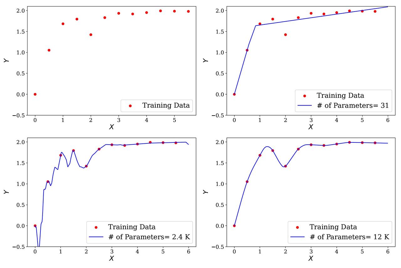
Let me walk you through the idea with an example and a figure from my recent survey “Deep Learning for Solving Economic Models” (check my post from yesterday):
◽ Step 1. Draw 12 random points from the function Y = 2(1 - e^{-|x + \sin(x)|}) and plot them in red (panel 1, top left, in the figure I include).
◽ Step 2. Train a very simple single-hidden-layer neural network with a ReLU activation and 31 parameters on these 12 data points. This is a “simple” network, and if some of the jargon is unfamiliar, do not worry; the key is just that this network is small.
The result is the blue line in panel 2 (top right). The network captures the overall shape of the data but lacks the capacity to interpolate all points.
◽ Step 3. Increase the network’s size to 2,401 parameters. Now we hit the interpolation threshold: the network can perfectly fit the training data.
The blue line in panel 3 (bottom right) does interpolate all 12 points, but it becomes wiggly, oscillating wildly outside the observed data (see the fluctuations between the second and third points on the left).
This is the textbook warning we teach in econometrics: overparametrization fits the training data beautifully but performs poorly out of sample. This is the U-shaped bias–variance tradeoff curve in action.
◽ Step 4. Now do something insane: push the network to 12,001 parameters for just 12 data points. Surely disaster must await.
Instead, panel 4 (bottom left) shows the opposite: the network fits all the data perfectly and creates a smooth, intuitive curve.
It reminds me of the old connect-the-dots puzzles from childhood: instead of drawing a wiggly mess, the network finds the “right” curve you would have drawn by hand.
This is the double descent phenomenon: the classical U-shaped bias–variance tradeoff extends into a double dip, where performance out of sample improves again once models become massively overparameterized.
So, the solution to too many parameters might be…even more parameters! Or, as we say in Spanish: if you don’t want broth, you’ll get two cups!
Why does this happen? I will try to explain our current (incomplete) understanding of this phenomenon tomorrow in another post, as it involves quite a few ideas.
But in the meantime, three key points to keep in mind:
1️⃣ We only have 12 points — double descent is not about large datasets.
2️⃣ We are using a single-layer neural network — this is not about depth.
3️⃣ The effect is not even specific to neural networks — you can find similar behavior with high-degree polynomials.
👉 This is why double descent is so surprising: it challenges decades of conventional wisdom in statistics and econometrics.
Finally, let me thank @MahdiKahou, my coauthor on much of my recent work on machine learning, for his help in preparing this example. He is the one who truly masters these methods and patiently teaches me about them every day. Anyone who wants to understand this material in depth would benefit greatly from talking to him.